

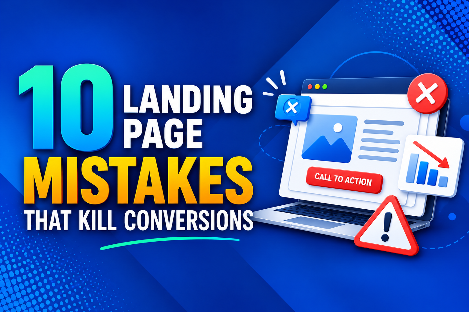
10 Landing Page Mistakes That Reduce Business Conversions
You have spent time and money bringing visitors to your landing page. Maybe you are running ads, sending emails, or sharing a campaign on social media. The clicks are coming in, but the sales, sign-ups, and inquiries are not. It is a painful gap, because a landing page has one job, which is to turn a visitor into a lead or a customer. When it fails at that job, every rupee you spend on driving traffic is partly wasted. The good news is that most landing pages lose conversions for the same handful of reasons, and these problems are usually simple to fix once you can spot them. Below are seven common mistakes that quietly hurt your results, along with practical ways to correct each one, whether you are working on your own or with a team that offers digital marketing Karachi businesses rely on.
1. An Unclear Headline and Value Proposition
The headline is the first thing visitors read, and it decides whether they stay or leave. Many landing pages open with something vague, clever, or overly creative that fails to explain what is actually being offered. Visitors who land on your page from an ad or a search result want immediate confirmation that they are in the right place. If they have to work to understand your offer, most of them will simply go back.
A strong headline states the benefit clearly and speaks to a specific need. It should tell people what they get and why it matters to them, using plain language instead of industry jargon. Support the headline with a short subheading that adds detail, such as who the offer is for or how quickly results can be expected. When a visitor understands your value within a few seconds, they are far more willing to keep reading. Clarity almost always beats cleverness on a landing page.
2. Weak, Hidden, or Competing Calls to Action
A landing page without a clear call to action is like a shop with no counter. People may be interested, but they do not know how to take the next step. Some pages bury the button at the bottom, others use dull wording like “Submit,” and others place five different buttons on the page so visitors cannot tell what to do first.
Your landing page should focus on one main goal. Whether that goal is booking a consultation, downloading a guide, or requesting a quote, every element on the page should point toward it. Make the button visible without scrolling, use a contrasting color so it stands out, and write the text around the benefit, such as “Get My Free Quote” instead of “Send.” Repeat the same call to action after major sections so visitors can act the moment they feel convinced. Having a single, focused action removes confusion and increases the chance that people will follow through.
3. Slow Loading and Poor Mobile Experience
Speed is one of the biggest silent conversion killers. When a landing page takes too long to load, visitors leave before they even see your offer, and you never know they were there. Heavy images, large video files, and too many scripts are the usual causes. The problem becomes worse on mobile networks, where patience is even lower.
A large portion of your visitors will arrive from a phone, so your page must work well on a small screen. Text should be easy to read without zooming, buttons should be large enough to tap comfortably, and forms should be simple to fill out with a thumb. Compress your images, remove anything that does not add value, and test the page on a real phone with an average connection. If the experience feels slow or awkward to you, it feels even worse to a visitor who has no reason to be patient.
4. Long and Complicated Forms
Forms are where many landing pages lose people who were otherwise ready to convert. Asking for too much information creates friction, and friction is the enemy of conversions. A visitor who is only mildly interested will not spend several minutes entering details about their company, budget, and preferences just to get a basic answer.
Ask only for what you truly need to take the next step. For many businesses, a name, email address, and phone number are enough to start a conversation. You can collect additional details later, once the relationship is established. Label your fields clearly, avoid confusing requirements, and show a helpful message after submission so people know their request was received. It is also worth testing the form regularly, because a broken form or an email that never reaches your inbox can silently cost you leads without any warning.
5. No Proof or Trust Signals
People are naturally cautious about sharing personal details or spending money with a business they do not know. If your landing page makes big promises but offers nothing to back them up, visitors will hesitate. Trust is a major factor in the decision to convert, and a lack of it is a very common reason pages underperform.
Give visitors reasons to believe you. Real customer testimonials, star ratings, case studies, client logos, and examples of past results all help to reduce doubt. If you have been featured in media, earned certifications, or worked with recognizable brands, show it. Even simple details such as a visible phone number, a business address, and clear refund or privacy policies make your company feel more real and reliable. Place these trust signals near your call to action, because that is the moment when visitors are deciding whether to take the leap.
6. A Mismatch Between the Ad and the Landing Page
Imagine clicking on an ad that promises a discount on a specific service, only to land on a general homepage that never mentions it. You would probably leave right away. This is called message mismatch, and it is one of the most common mistakes in paid campaigns. When the promise in the ad does not match what appears on the page, visitors feel misled, and trust disappears instantly.
The wording, offer, and visuals on your landing page should continue the conversation that started in the ad. If the ad mentions a free consultation, the headline on the page should mention it too. If you run several campaigns for different audiences or services, create a separate landing page for each one rather than sending everyone to the same place. A tailored page feels relevant to the visitor, and relevance is a powerful driver of conversions. It also tends to improve ad quality and lower your cost per click over time.
7. Clutter and Too Many Distractions
A landing page works best when it is focused. Many pages are overloaded with navigation menus, social media icons, unrelated links, sliders, pop-ups, and long blocks of text. Each of these gives visitors another reason to wander off instead of completing the action you want. A cluttered page also makes it harder to understand what matters most.
Simplify the design so that attention naturally flows toward your offer and your call to action. Remove the main navigation menu if it is not needed, because it gives people an easy exit. Use plenty of white space, short paragraphs, and clear headings so the page is easy to scan. Choose a few strong visuals that support your message rather than decorating the page for its own sake. A clean layout does not mean an empty one. It means every element has a purpose, and anything that does not support the goal is removed.
How to Keep Improving Your Results
Fixing these seven mistakes is a strong start, but landing page performance is never finished. The best-performing pages are tested and refined over time. This ongoing process is known as conversion rate optimization, and it helps you understand what your visitors respond to instead of guessing. Try testing one change at a time, such as a new headline, a different button color, or a shorter form, and measure how it affects your results. Over a few weeks, small gains add up to a meaningful improvement.
Make sure you are tracking the right numbers as well. Look at your conversion rate, bounce rate, and the sources that bring the best visitors. Heatmaps and session recordings can show where people click, where they stop scrolling, and where they give up. These insights make it much easier to decide what to fix next.
Final Thoughts
Your landing page is often the most important page in your entire marketing effort, because it is where interest turns into action. Unclear headlines, weak calls to action, slow loading, long forms, missing trust signals, mismatched messaging, and cluttered layouts can all quietly drain your conversions. The solution is not to spend more on traffic but to make your page work harder for the visitors you already have. Review your landing page honestly, correct the biggest problems first, and keep testing as you go. A focused, fast, and trustworthy page makes it easy for people to say yes, and that is what turns clicks into real business growth.
- Monuments historiques
- Restaurant Traditionnel
- Образование
- Mode
- Formation
- Information
- Restaurant
- culture
- تسويق
- Tourisme
- سياحة
- تنمية
- Découverte
- Art
- Causes
- Crafts
- Dance
- Drinks
- Film
- Fitness
- Food
- Игры
- Gardening
- Health
- Главная
- Literature
- Music
- Networking
- Другое
- Party
- Religion
- Shopping
- Sports
- Theater
- Wellness
 Russian
 English
 Arabic
 French
 Spanish
 Portuguese
 Deutsch
 Turkish
 Dutch
 Italiano
 Romaian
 Portuguese (Brazil)
 Greek